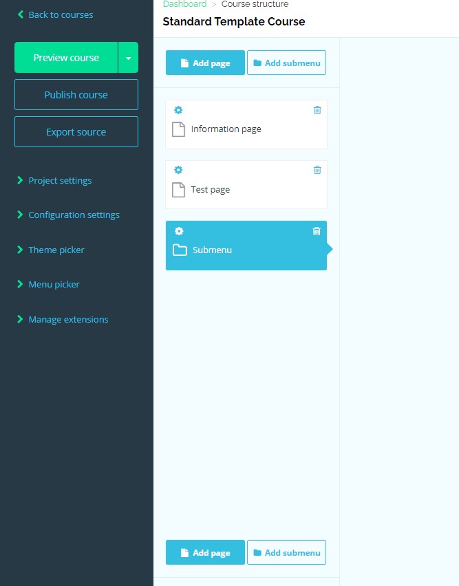
We have a customer who is using AT 0.10.5, and he noticed that the columns in the "Dashboard > Course structure" view got stacked on top of each other when his Chrome zoom was between 75% and 90%.
This is not a big issue, but I just wanted to know if this is addressed in newer versions.
