Picture of Daryl Hedley
Adapt Framework - generic question button functionality
by Daryl Hedley - Friday, 14 February 2014, 1:57 PM
 

Hey,

Just wanted to run an idea around that Paul Welch and myself have been discussing. We've research how our buttons work for question components and have also received feedback from clients using them. A few things we think are missing are:

  • Attempts left count down - enables the user to see how many attempts the questions have.
  • Toggle for feedback - enables the user to view feedback at any point feedback is available by clicking a button
  • Overall correct/incorrect when question has been answered - shows a clear indication of whether the user got the question fully right or wrong.


Currently we have a setup where we switch between the following buttons:

  • Submit
  • Reset
  • Show correct answer
  • Show users answer

Our proposed solution is attached and we feel it includes everything we have to date plus the features that are missing. 

The PDF shows stages 1-6 of answering a question with this dual button approach. The lower 4-6 stages are when the user gets the second attempt correct. I'll break down the stages below:

  1. User has not selected any item and has two attempts, 'Feedback' button is disabled (but could show a hint like - "Select an item you think is correct and then select submit").
  2. User selects an item
  3. User has selected 'Submit' and the item is marked correct. 'Attempts' gets updated to 1. 'Feedback' button is still disabled (but could be enabled if attempt feedback is enabled). 'Submit' button becomes reset.
  4. Question is reset with 'Reset' button turning back to 'Submit'.
  5. User attempts the question again by selecting an item.
  6. User selects 'Submit' button and all attempts are used up. 'Attempts' box turns into either a correct tick or incorrect cross. 'Feedback' button is active. If the user got the final attempt wrong then the 'Submit' button turns into 'Show correct answer' which toggles between showing the correct answer or the users answer (this is not shown in the diagram but can be viewed in the Adapt demo). However if the user gets the final attempt correct the 'Submit' button stays and is disabled.

*** All feedback is displayed as normal - when the user clicks 'Submit'. ***

From a developers point of view this would be set up as a subview of questionView that communicates via events. The button templates would be a Handlebars partial that will live in the theme - like all other templates - so a front end developer can change the look and feel of them.

Please can you post any comments, concerns or thoughts on the proposed solution?

Thanks,

Daryl
Picture of Kevin Corry
Re: Adapt Framework - generic question button functionality
by Kevin Corry - Friday, 14 February 2014, 3:19 PM
 

Hi Daryl,

I like the proposed solution, especially how users will be able to view feedback again once dismissed. The addition of a 'hint' type of feedback that you alluded to would be a nice feature.

One very minor suggestion on the attempts remaining section - perhaps this could be 'Attempt 1 of 2', etc;

Regards,

Kevin

Picture of Dennis Heaney
Re: Adapt Framework - generic question button functionality
by Dennis Heaney - Friday, 14 February 2014, 2:57 PM
 

I think this is a neat approach. I have a very minor - possibly irrelevant - comment about the wording on the "Attempts" countdown. As shown in the pdf, I read this as displaying the number of Attempts I have already made. It would be clearer if it says "Attempts Remaining".

As I hinted, this might be irrelevant since it may well be configurable, but I thought it wouldn't hurt to mention it.

Picture of Matt Leathes
Re: Adapt Framework - generic question button functionality
by Matt Leathes - Friday, 14 February 2014, 3:37 PM
 

I concur with 'attempts remaining'

BUT what to do if you've set an infinite number of attempts? ;-)

A possible alternative is to have some instruction text that could be displayed whenever there are attempts remaining that can have 'dynamic' text included in it.

for example:

"Select the Feedback button to view your feedback again, or click the Reset button to try answering question again. You have [ATTEMPTS] remaining."

or:

"Select the Feedback button to view your feedback again, or click the Reset button to try again. You can attempt this question as many times as you like."

If you do go down that route you need to have two sets of instruction text, one for when there are attempts remaining and one for when you've used up all your attempts.

Paul Welch
Re: Adapt Framework - generic question button functionality
by Paul Welch - Friday, 14 February 2014, 4:23 PM
 

Hi Matt,

I also like the idea that, if instruction text is present, it carries through the number of attempts dynamically.

With regards to the button structure - Its pretty rare you have unlimited attempts, but I guess a simple answer would be to just have the word 'Unlimited' instead of 'Attempt1 of 2'

Picture of Nicola Bamford
Re: Adapt Framework - generic question button functionality
by Nicola Bamford - Friday, 14 February 2014, 3:21 PM
 

Hiya

I like the idea of showing attempts, but I'm wondering if the attempts should only be on screen if there is more than one? If there is only one attempt, maybe the Feedback button could stretch out to the full width of the component.

Also, I know this is only a mock, but the placement of the 'Attempts' button, and its look, immediately makes me assume that it's clickable.

Picture of Nicola Bamford
Re: Adapt Framework - generic question button functionality
by Nicola Bamford - Friday, 14 February 2014, 4:07 PM
 

Matt - just seen your post. Like the idea of the dynamic text which pulls in the attempt number.

Another approach - do we even need the Attempts counter? Why not just a 'RETRY' button which is only visible if the attempts is set to more than one?

I'm just trying to define the value that the learner gets out of knowing how many attempts they've got.


Paul Welch
Re: Adapt Framework - generic question button functionality
by Paul Welch - Friday, 14 February 2014, 4:35 PM
 

It's a fair challenge Nicola and I think one for discussion. I err on the side of putting it in, but you could just as well argue that its just as useful to indicate how many options should be selected before submitting.


Picture of Mathew Gancarz
Re: Adapt Framework - generic question button functionality
by Mathew Gancarz - Friday, 14 February 2014, 4:49 PM
 

I'd agree with Nicola on this about the questionable value of the # of Attempts, especially on whether this is something that's meant to be used as a formal assessment or as a learning check.

Psychologically showing the # of attempts also primes the learner into a heightened state, since it indicates that this is something very important and there is a potential element of failure.

If this element is meant to also double for informal learning checks with an infinite number of attempts, I would say the Attempts # should not appear at all.

I'm also worried about the space for the feedback. Is that a field that could stretch to accommodate a few sentences of text? Our courses tend to cover complicated medical material, so our feedback and questions tend to be on the long side as it has to use medical terminology and specific cases.

Paul Welch
Re: Adapt Framework - generic question button functionality
by Paul Welch - Friday, 14 February 2014, 5:42 PM
 

Hi Mathew,

The feedback is still delivered in a manner akin to the current tutor, so plenty of space - paragraphs in fact.

It's also displayed automatically with the button being used to triggered the feedback should a learner wish to review the feedback at a later date - a bit of an oversight on our part the first time around when we designed Adapt!

With regards to formal assessment we're typically setting those at 1 attempt so can see it being a bit redundant feature there. 

Picture of Matt Leathes
Re: Adapt Framework - generic question button functionality
by Matt Leathes - Friday, 14 February 2014, 4:44 PM
 

It is my experience that most courses generally have questions set to 1, 2 or infinite number of attempts.

So I'd agree, the counter does seem a bit redundant - the dynamic instruction text therefore gives you the option to include it or not, as required.

Picture of julie prescott
Re: Adapt Framework - generic question button functionality
by julie prescott - Friday, 14 February 2014, 6:36 PM
 

Hi I would just like to put my vote in for viewing the number of attempts left - or at least having the option to include it if needed.

We currently host several moodle sites for commercial use and it has been necessary to 'tweek' the code within the course and scorm module pages to display the number of attempts left as our clients have specifically requested it and find this information useful.  We usually allow 3 attempts on our scorm modules.  

Can I just clarify; will the attempt counter be incremented when a user accesses the course or when the user has completed/passed/failed the course?  Will exiting a course part-way through be classed as an attempt?  

We usually designed our scorm modules with a quiz at the end. If the user has accessed the module and exited part-way through, without completing the quiz, I would not class this as an attempt as they have not taken the quiz, therefore have not got a result yet.

regards, Julie

Paul Welch
Re: Adapt Framework - generic question button functionality
by Paul Welch - Saturday, 15 February 2014, 4:23 PM
 

Hi Julie,

The attempts feature is provided at the component level, rather than the course level.  If I understand correctly what we really want here is the ability to set multiple attempts for a final, formal assessment when it's used to set the SCO to ‘complete’ or ‘passed’. We can certainly do this, I’ll need to check whether it’s in the MVP 1.0 as I can’t recall from memory. I’ll check and update accordingly.

If it’s of interest, we’ve tended to use multiple attempts for more formative questions positioned at the start of an Adapt page or for knowledge check question at the end of short tutorials, rather than questions which contribute to the completion status of the SCO. In this situation we typically set at a single attempt and provide no question level feedback to keep the assessment challenging (particularly if there isn’t a quiz constructed from a randomised bank of questions – this feature is coming soon!)

That said, there’s no reason why you couldn’t of course have multiple attempts for questions in a final quiz as well as question level feedback to support the quiz completion feedback should that be required.

Thanks,
Paul

Paul Welch
Re: Adapt Framework - generic question button functionality
by Paul Welch - Friday, 14 February 2014, 4:43 PM
 

Hi Nicola,

If we stretch the feedback button on single attempt questions we lose our placeholder for the final feedback tick/cross. We could do that but then we we lose the consistent layout of the grouping - in the design outlined this grouping is consistent regardless of question type/attempts - I feel this is a strength.

What do others think? 

Picture of Mathew Gancarz
Re: Adapt Framework - generic question button functionality
by Mathew Gancarz - Friday, 14 February 2014, 4:55 PM
 

In terms of the place holder for the final feedback tick/cross, it looks like it is only used when there is more than one attempt allowed, but less than an infinite # of attempts. Could I suggest that if there is an infinite # of attempts set or only one attempt, the Attempts 'block' is just not used and the feedback 'block' takes up the entire width?

In those scenarios I honestly don't see much value in duplicating the tick/cross since it already exists on the answer that was selected.

Paul Welch
Re: Adapt Framework - generic question button functionality
by Paul Welch - Friday, 14 February 2014, 5:43 PM
 

Hi Mathew,

We've found that when you leave the marking just on the items it can get a little muddied when there is more than one correct answer:

  • Do you mark everything with a tick and a cross, even if it wasn't selected?
  • Do you only mark the selected items and which case how do you show the correct items which weren't selected? 

There seems to be little consensus on this so we felt that having an over-arching tick or cross was the most elegant way around the problem.


Picture of Mathew Gancarz
Re: Adapt Framework - generic question button functionality
by Mathew Gancarz - Friday, 14 February 2014, 7:50 PM
 

Good point, I had forgotten about select multiple options questions. In regards to the feedback, great to hear it will have plenty of space!

Paul Welch
Re: Adapt Framework - generic question button functionality
by Paul Welch - Tuesday, 18 February 2014, 3:56 PM
 

Hi,

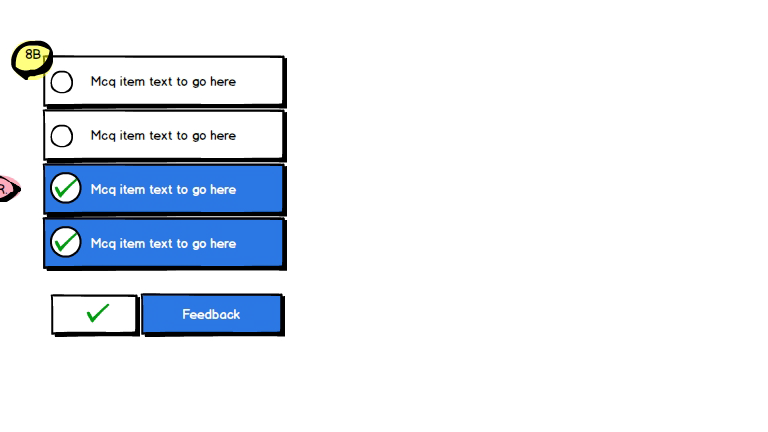
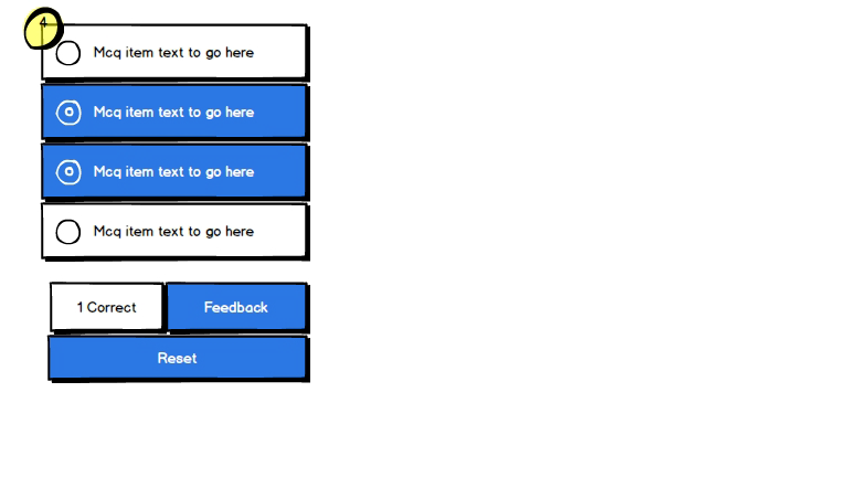
I’ve done a bit more thinking around the generic question button functionality and created a few more wireframes. I’ve worked on the proviso that number of attempts, if required, will be handled by dynamic text position above the question options. As mentioned above, at the heart of this redesign is the need to provide:

  • the ability to view feedback when returning to a question at a later date
  • clear mechanism for marking questions that have several correct responses      

I’ve also aimed to:

  • reduce the number of unnecessary buttons
  • provide the learner with a steer on the number of options that they need to select prior to submitting their answer (I’d suggest this was a feature which could be toggled on/off. If toggled ‘off’ the
  • position buttons/functionality in a manner so that those that are always displayed (rather than sometimes) are position on the first of the two available rows
  • provide a meaningful approach to marking questions after a partially incorrect/first attempt
  • ensure that learners can view the first attempt feedback again should they close the tutor feedback before resetting the question (NB: Don’t forget that the feedback button is used to revisit feedback which has already been automatically launched and subsequently closed and is not the primary means of displaying this important information).

The wireframe shows a 2 attempt/2 correct option question.

Feedback, as always, appreciated.

Cheers,
Paul

Picture of Nicola Bamford
Re: Adapt Framework - generic question button functionality
by Nicola Bamford - Tuesday, 18 February 2014, 5:55 PM
 

Hi Paul

I really like the idea of showing the learner how many options they've got right/wrong on first attempt, without specifically pinpointing the options.

Treatment wise, the visual version of the first attempt's correct/incorrect is more universal but I can see what you mean about it implying that a certain option is right or wrong. The counter argument to this is that if you were referencing specific options, the marking would logically be next to the options themselves....?

Also showing the initial instruction on the Submit button is a great space saver, as it leaves more room for the dynamic attempts text. 

Picture of Mathew Gancarz
Re: Adapt Framework - generic question button functionality
by Mathew Gancarz - Wednesday, 19 February 2014, 2:37 PM
 

Hi Paul, looks good to me, I think it will work well and is nice and simple.

Picture of Daryl Hedley
Re: Adapt Framework - generic question button functionality
by Daryl Hedley - Friday, 28 February 2014, 2:03 PM
 

Hey Paul,

I think what we're going for is brilliant! I have one small suggestion. Can we make the buttons sit in the same block. So you would have the 'attempts' bar above the 'feedback' and 'submit' button.

This way it means the buttons are buttons and the display counter (whether that be attempts or amount of correct answer) is a non-clickable element. Means tabbing for accessibility is easier to follow as well as placing buttons as groups.

I think we should also consider everything in the buttons group as a configurable option. So we can show or hide anything the learning designer wants.

Thanks,

Daryl

Paul Welch
Re: Adapt Framework - generic question button functionality
by Paul Welch - Friday, 28 February 2014, 4:22 PM
 

Hey D,

Thanks. My thinking with regards to the layout was essentially based on two key ideas:

  • Make the button you’re likely to use next the biggest of the cluster. E.g. the feedback button would only be used if you wished to revisit the automatically displayed tutor feedback, unlike the reset button which in this two attempt question would be required.


  • Place buttons which don’t always appear on the second line, keeping the cluster as clean looking as possible in as many instances as we can. So, if we take the example below then the tick/cross will always be required, as would the feedback button. However, a reset or view model answer button is dependent on how the question answered/number of attempts, etc.


I can definitely see how tabbing would be simpler and also the logic of keeping the buttons together. I also quite like the idea of always keeping the button you need to select the largest in the cluster though, but I’ll go with the consensus.


Cheers,

Paul

Picture of Ashish Pathak
Re: Adapt Framework - generic question button functionality
by Ashish Pathak - Tuesday, 20 June 2017, 6:55 AM
 

I want show in feedback using assessment extensions which question learner attempt incorrect. Please suggest.  

Picture of Matt Leathes
Re: Adapt Framework - generic question button functionality
by Matt Leathes - Tuesday, 20 June 2017, 9:01 AM
 

Hi Ashish

If you have a question like this please submit it as a new post. If you post it to a really old (and unrelated) thread like this, it's likely to just get lost.