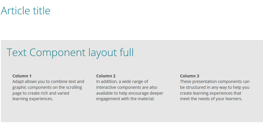
Hi, I'm using <div> tags for layout.

<div class="grid">
    <div class="column"><strong>Column 1</strong> Adapt allows you to combine text and graphic components on the scrolling page to create rich and varied learning experiences.</div>
    <div class="column"><strong>Column 2</strong> In addition, a wide range of interactive components are also available to help encourage deeper engagement with the material.</div>
    <div class="column"><strong>Column 3</strong> These presentation components can be structured in any way to help you create learning experiences that meet the needs of your learners.</div>
</div>
Less code:
.grid {
  margin-right: auto;
  margin-left: auto;
  display: -webkit-flex;
  display: flex;
  -webkit-flex-wrap: wrap;
  flex-wrap: wrap;
  clear: both;
}

.grid:before {
  content: "";
  display: table;
}

.grid:after {
  clear: both;
}

.grid > .column {
  position: relative;
  width: 100%;
  display: -webkit-flex;
  display: flex;
  flex: auto;
  -webkit-flex-direction: column;
  flex-direction: column;
  padding: @item-padding;
}
@media (min-width:@device-width-medium) {
  .grid > .column {
    width: 25%;
  }
}
The div attributes has worked for me.