Hi,
I’ve put together some copy for the main menu that outlines what responsive learning design is. Be good for people to review and agree it’s appropriate and describes a shared vision. Its available via a link of the home page now.
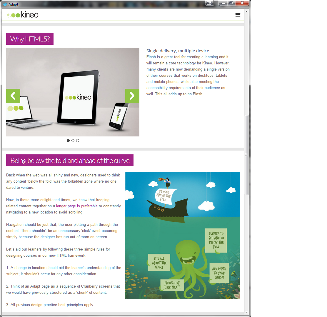
Within this copy, I’ve outlined the various layouts that we’ve used internally, namely:
- Deep scrolling articles (standard scrolling)
- Deep scrolling article with block slider
- Block slider article (lateral scrolling)
- Triggered components (either deep or standard)
We have used deep scrolling and block slider on all of the 25 odd Adapt projects we’ve created to date so I’d suggest this came as standard in the first release. That said, triggered components is also becoming popular as it provides an opportunity to create graphically rich pages that can still contain all of the standard Adapt functionality and I’d suggest that this functionality came packaged up with core from the beginning.
As always, all comments and recommendations for improvements are welcome.
Paul
