Hi, I would like to share some new Adapt components.
You can view them in action here.
All components are available on my github profile.
Thanks to all the adaptlearning community for their support.
Hi, I would like to share some new Adapt components.
You can view them in action here.
All components are available on my github profile.
Thanks to all the adaptlearning community for their support.
Hi Ignacio,
We really love these new plug-ins and have recently installed the Cards, Vertical Items, Counters, and Link Items.
We really like the 7th option (horizontal card with a picture on the far left or right) you have done with the cards and would like to know how you set this up. We also aren't sure how to get 3 cards side by side.
Any help you can provide would be greatly appreciated.
Thanks!
Sherri
Hi Sherri, thank you I appreciate it.
By default, all these components have minimal css styling.
I prefer to modify the appearance from the theme.
The 7th option has 'list' class on the cards component.
You can add this to your custom theme or on your Authoring Tool from project settings >Custom CSS/LESS code .cards{
&.list{
.cards__item-container{
flex-direction: row;
align-items: center;
}
.cards__item-body{
margin-right: 2rem;
}
.cards__item__image{
min-width: 180px;
padding: .5rem;
}
.cards__item.row-reverse{
.cards__item-container{
flex-direction: row-reverse;
}
.cards__item-body{
margin-right: 0;
margin-left: 2rem;
}
}
@media (max-width: @device-width-small) {
.cards__item-container,.cards__item.row-reverse .cards__item-container{
flex-direction: column;
}
.cards__item-body{
margin-left: 0.5rem;
margin-right: 0.5rem;
}
}
}
}
And then in the classes of one of the items add: row-reverse
To get 3 cards side by side you can use the property Columns.
I hope this helps!
Hi Ignacio, loving your work on these components!
Just wondered if you have a guide to how to set up the 'Adapt notify links'. Basically, we have a course which is very academic and has references throughout, and we think this extension would be perfect for this use.
Thanks in advance!
Hi Mark, thanks.
- Add the adapt-notifyLinks extension to the adapt project
- Go to the project settings and check is enabled.
- Then, use a <a> tag with class 'notify-link' and use an adapt model id as href attribute, like this:
<a class="notify-link" href="#63efcfbf12a2cc56007f1cf5">Open an adapt model in a notify popup</a>.
Hope this helps.
Hi Ignacio,
Thanks for the reply. Will give it a go and will be in touch if I have any other questions.
Hi Ignacio,
I followed your steps but I'm only getting an empty notify popup...
Do I have to configure the component for the popup in a special way
or can I just copy a block oder component ID?
best,
Martin
Hi Martin,
Without looking at Ignacio's extension my guess is the content is within javascript or within the link like the example below. I personally try to use the javascript method but thought I would share the a tag inline version too. I will let him respond more to the functionality of his extension but perhaps this helps to lead you in the right direction. I also have a component version that works similar but might not be as flexible as his extension version.
EXAMPLE BELOW
<a href="#" onclick='require("coreJS/adapt").trigger("notify:popup",{title:"Notify Title Text",body:"Notify message"});return false;'>Click here to show a Notify popup!</a>
Here is what the javascript version looks like...
"_notifyOnComplete": {
"_isEnabled": true,
"title": "COURSE COMPLETE",
"body": "Well done! You have completed the course and may now close this window."
}
Hi Mike,
thanks for sharing your idea and your component!
In this case, unfortunately, it will not help me.
I have a course that had to contain a lot of videos.
My idea was to create a kind of link overview and with those links it opens a video/media component as a notiy popup...
Hi Martin, I just updated the notifyLinks extension.
Could you give it another try?
I would like to pick up this topic again...
The plugin adapt-notifyLinks works very well.
But it is only possible to link to an ID of a block or a component, correct?
The disadvantage is, as soon as we copy or export/import the course, the ID's are regenerated. This has the disadvantage that you have to re-link all the buttons / layers. Is there an alternative to this?
For example, that a layer gets a class "Layer_01", to which you can then always fix reference?
best,
Martin
Hello Martin, it's possible that we can have something like this in the properties of the blocks and components. 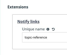
I'll let you know when it's updated in the GitHub repository so you can test it.
Hi Ignacio,
We're using the Vertical Items component, and wondered if there was a way to alter the 'percentage in view' within the viewport for the animations?
Many thanks in advance.
Mark
https://github.com/nachocinalli/adapt-verticalItems/blob/master/js/VerticalItemsView.js#L23-L32
Not without changing the code, the inview even is reasonably brutal, the onscreen event has more detail.
See
https://github.com/cgkineo/adapt-graphicLottie/blob/master/js/LottieView.js#L32-L42
Thanks for the reply.
Sorry, I'm not a coder by trade. Would you suggest I swap the code between the 2 examples and import my own version of the plugin?
Hi Ignacio - loving the new Drag and Drop Multiple component!
Just had a quick query - I'm trying to reduce the depth of the '.dnd-multiple__dropitem' area due to it being a little large on mobile devices but don't seem able to do so using the CSS. Do you have any tips? I've reduce the padding of the '.dnd-multiple__dragitem' but it doesn't seem to have any affects on the background/component depth.
Thanks in advance!
Mark
Hi Mark,
Glad to hear you're enjoying the new drag and drop multiple component!
It depends on the framework version you are using, but it could be something like this:.dnd-multiple {
&__dragitem {
padding: 0.25rem;
@media (min-width: @device-width-medium) {
padding: 1rem;
}
}
&__dropitem {
padding: 0.25rem;
@media (min-width: @device-width-medium) {
padding:1rem;
}
}
}
Adjust the measurements in the css media query as needed (device-width-medium or device-width-small) and the different values in the padding as well.
Hope it works for you.
Thanks Ignacio - I'm using the Authoring Tool.
I've tried the CSS above but it doesn't appear to be helping. FYI, my course looks like the following:
Thanks again.
It seems that there is some CSS style in your Adapt theme that is affecting the drag component.
You should see something like this:
Could you try it using the vanilla theme and not applying any custom styles? From your screenshot, it appears that there might be a minimum height set for the component__widget.
Would it be possible for you to share a public link to the course?
Alternatively, if you can share it with me, I can take a look and see what's going on.
Hi - apologies for the late response.
I've set up a preview link below. I've tried taking out the CSS and theme styling but still having an issue with reducing the background box height once the padding has been reduced on the labels.
https://eggu.co.uk/preview/drag-and-drop-test/#/id/64ccc0d12029633d7e79f7e7
Many thanks once again.
Mark
Mark, there's a problem with the component that sets a minimum height for the columns (it takes the number of options and multiplies it by 4). For now, you can solve it from the theme by doing something like this:
.dnd-multiple__dropitem {
min-height: calc(3rem * 12)!important;
}
I'll probably make changes to this in the component repository to handle it differently.
Thanks for trying it out.
Hi Ignacio,
I really like your Trialogue component!
Is there a timeframe for that to be useable in the authoring tool?
Thanks
Hi Steve, I've updated the Trialogue component so you can use it in AAT.
Can you please try again?
Hi Ignacio.
Happy New Year! Big fan of your components, keeps Adapt fresh and relevant. Just looking at the Blurring component and wondered when you would be releasing this on GitHub (currently just a readme file for download).
Many thanks in advance!
Mark
Hi Mark, Happy New Year to you too and thanks for your kind words.
I'm glad you're using the Adapt plugins.
I have just updated the adapt-blurring GitHub repository.
You can see the configuration in the project settings. 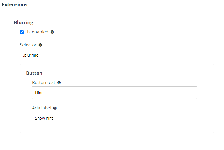
You'll need to add the 'blurring' CSS class, for example, in my demo.
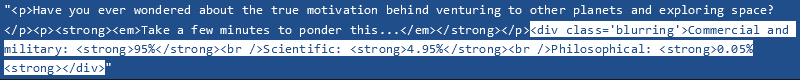
Let me know if it works for you.
Hi Ignacio,
Any timeframe for the swiperSlider being released?
Thank you for all that you do!
Hi!
Excellent components. Thanks for sharing! I noticed the rep for the grid menu is empty. Are you updating it?
Hi again,
So I'm about to explore the gridmenu but I can't get it to work. I've created one page with some dummy content and uploaded an image to the page's graphic. All get is an blank page (and the loader looks different, funny enough). I can preview the same course using the native box menu without problem.
Node 16.20.2
Framework 5.37.9
Latest version of the authoring tool.
Would you rather have me post this as an issue in the github repo?
Hi Ignacio,
I'd love to try out the GSAP animations extensions! Looks super cool!
Thanks for all that you do!
Hi Marissa, thanks!
I just uploaded some new examples using GSAP.
In my github are the plugins:
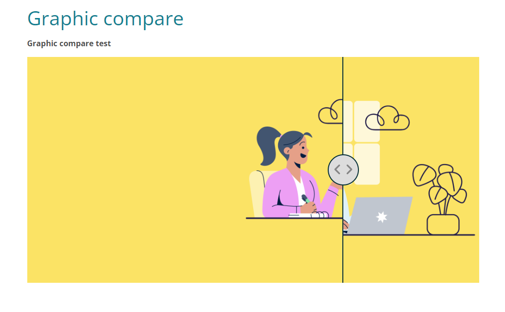
Hi Ignacio - loving the continued new components as always, great work!
Just wanted to trial the 'Graphic Compare' but having issues getting it to show up, just has an empty space where the component should be.
Thanks
Mark
Hi Mark, thanks.
Could it be that the component wasn't imported correctly into your Adapt authoring tool?
Could you try uninstalling it and reinstalling it?
What version of the framework and the authoring tool are you using?
Hi Ignacio,
Weirdly, the component worked a while ago when initially tested but had stopped so I just installed the 1.2 version but it still doesn't show.
We're currently using framework 5.35.0 if that helps?
Thanks again.
Ok, create a new course with just that component and then use the Export source option in the authoring tool to share the zip file with me so I can review it.
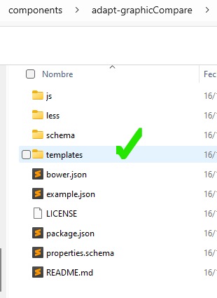
Mark, for some reason I don't know, the component didn't import correctly into your AAT. As seen in this zip, the 'templates' folder is missing inside adapt-graphicCompare. Like I mentioned before, you could try uninstalling the component and reinstalling it. If that doesn't fix it and you have access to the AAT, you can look for the adapt-graphicCompare folder and manually add the template.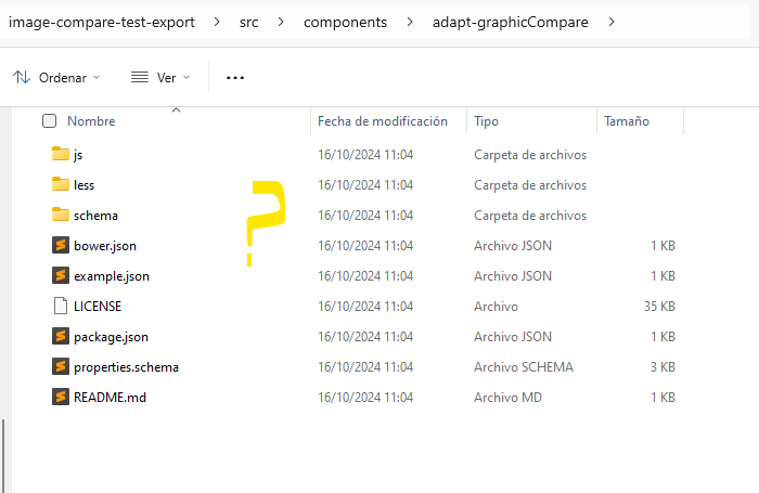
