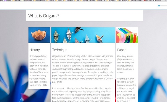
The subviews/columns are formatted as inline-blocks, so on small screens they wrap. When an individual column is wider than the screen, its style is overwritten with "width:auto" so that the text can reflow within the allotted space. In the image below, you'll find that the left and right columns from the image in the original post have retained their specified width, but the center column with header "Technique" has a width of "auto".
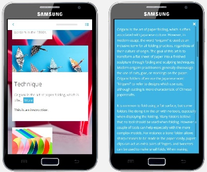
The truncating of the text, inclusion of a "More" button, and deployment of a popup are features of the subview/subcomponent, adapt-textPlus, not of multiColTextPlus per se. multiColTextPlus acts as a "wrapper" and is dependent upon the standalone component adapt-textPlus. FYI, completion status of the main component is dependent upon the natural completion of the individual subcomponents, either by coming in view or by opening the popup.
I've included in the code just a couple more bowser.js tests for mobile and tablet. These supplement the typical tests for Adapt.device.screenSize. So the code is ready for a developer to tweak to meet needs.
I tried to be thorough with my README.md, but felt an easier introduction could be helpful. I've started a github page from which I plucked these images.