Responsive e-learning design
Introduction
We live in a multi-device world. The growth of internet enabled devices such as smartphones, tablets and laptops means that increasingly we have to deliver learning solutions that work on all devices. This is not as simple as a desktop solution and a mobile solution; what is required is a multi-device solution. 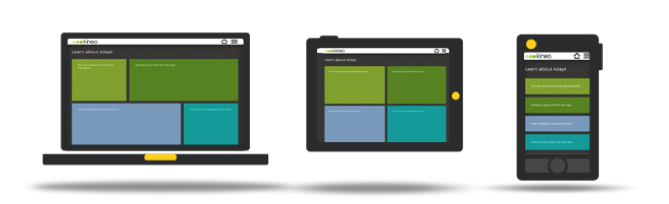
What is responsive e-learning?
Responsive E-learning Design takes its inspiration from Responsive Web Design; an approach to design that ensures a single version of a website (or an e-learning course created as a web app) can provide a viewing experience optimised to complement a variety of different devices, from desktop monitor to smartphone.
This tailored viewing experience is achieved by:
- providing dynamic layouts which allow for the resizing of onscreen elements to make the most of the space available (fluid grid concept)
- automatically detecting the characteristics of the device being used and applying an appropriate style to all onscreen elements (Media queries and CSS)
- ensuring all images can be scaled to complement the device being used at the time
Read more in our Responsive eLearning Forum.
What is the Adapt framework?
- Multi-device delivery –The framework uses JavaScript and HTML and as such offers the cross browser and platform compatibility you’d expect. A single build of a course will work across all supported devices and browsers, so no need to create a desktop version and then multiple versions of a native app to accommodate different mobile operating systems.
- Ease of maintenance – keeping content current becomes less problematic if there is only one version being maintained. In addition, due to the ubiquity of the technology used to create Adapt courses, the wider developer community will be able to work with the output.
- Future proof – the framework is designed from the ground up to run as well on a mobile device as it does on a desktop. This is sensible given recent trends, with mobile web browsing soon to overtake the desktop as the most common means of accessing the internet. There is also a similar trend with the hardware being purchased, with mobile devices already outstripping the desktop in many markets.
- Accessibility ‘out of the box’ – Courses created in Adapt Learning are fully accessible with no need for a separate version to comply with DDA guidelines
Innovations in design
Adapt isn’t just a fresh take on an e-learning framework, it also offers an innovative approach to design and course navigation and incorporates, what we think, are several exciting developments:
- Components instead of templates – pages are constructed by combining a wide range of interactive components in any number and mix required.
- Removing unnecessary navigation – It makes sense to keep all related content together and to only navigate somewhere new when the content demands it, not when the designer has run out of room on the screen. To make this possible we’ve implemented a scrolling page layout which leverages much of the latest thinking in web design into the world of e-learning. For example, previous ‘sacred cows’ of web design such as no content ‘below the fold’ are now being challenged as we now design for a more web-savvy audience.
- Preferences – Not sold on scrolling page layouts? No problem, more traditional linear layouts are just as easy to implement.
Tailoring the content to the device
Responsive E-learning Design is more than having the ability to present an entire course on a variety of different devices; it’s also about having total control of what content is shown on each of these different platforms.
We’d suggest that presenting an hour long course on advanced accountancy on a mobile screen that’s 350 pixels wide may not be the greatest way to deliver this training – it’s crying out for the space and comfort offered by a desktop environment. However, creating this as a desktop course and then making all the summary screens, takeaway guides and expert tip videos available as a short mobile course would be a great way of getting more mileage from a course.
The Adapt framework has the flexibility for every element of the design to be flagged so that you can decide how and what content is shown on a desktop/laptop, tablet and smartphone. This ensures we can provide users with learning on mobile, whether that is an entire courses or a short aide mémoire.
Layout and Navigation
Perhaps the most immediately obvious difference between Adapt and other tools and frameworks is what’s possible with both layout and navigation.
This change has come about out of a need to deliver content on multiple platforms but also due to the more sophisticated audiences we are now designing for, who are more comfortable with scrolling environments, rather than presentation of information within a sequence of single, fixed-position pages.
These scrolling layouts provide us with:
- an opportunity to structure content in more varied ways (see the three diagrams below for examples of possible layouts)
- an ability to weave in an art direction throughout an entire course, rather than just in the menu and the limited space available in the navigation and branding bars
- reduces redundant clicks due to needless navigation driven by the designer running out of onscreen ‘real estate’
These longer pages require their own hierarchy and nomenclature to ensure content is structured in a coherent manner.
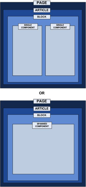
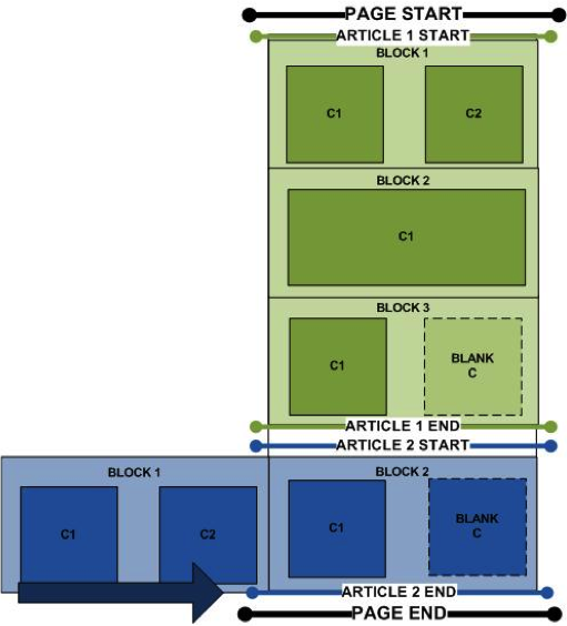
Accordingly, we’ve agreed on the following structure within a page:
- Pages consist of ‘Articles’.
- Articles consists of ‘Blocks’
- Blocks hold either two single or one spanned interactive widget called ‘Components’.
Think A, B, C!
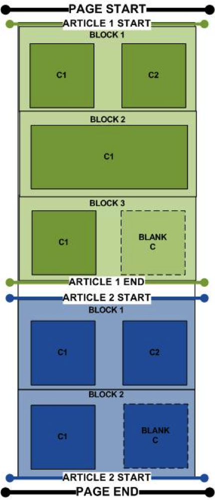
Layouts: ‘Deep Scroll’ Layout
The most typical layouts are likely to be based around a deep scrolling page (shown right), with blocks stacked one on top of the other.
This allows for the presentation of content in quite a structured manner, providing an implied order or learner journey, in which to work through the content.
Navigation is achieved via scrolling on the desktop or gesture on mobile devices. This layout also reduces the risk of overrruns which in turn makes it an appropriate choice for any course which is likely to be localised into another language.
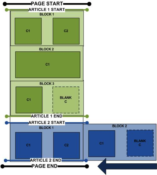
Layouts: ‘Deep Scroll’ Layout with ‘Block Slider’ functionality
‘Block Slider’ allows for the design to incorporate an alternative block, which is triggered by some kind of event, such as selection of a button.
One common example of how this functionality may be of use is within a goal-based scenario where Block 1 contains the knowledge checks and Block 2 the associated tutorial content.
Block slider will typically be used in a deep scrolling page (shown right) and you must have a dedicated Article assigned for the block slider so any content prior to and after the block slider must be in separate articles.
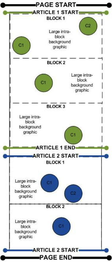
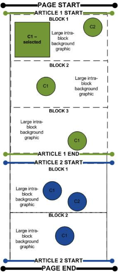
Triggered Component’ Layout
A triggered component layout allows for a large graphical environment to be created that contains icons which, once selected, trigger an associated component in a pop-up. These types of layouts allow for the creation of visually rich, highly exploratory environments. Again, navigation is achieved via scrolling on the desktop or gesture on mobile devices.
The first diagram on the left below shows a deep scroll layout with the component icons positioned over a background graphic. The second diagram on the right shows the first icon in Article 1, Block 1 selected and therefore displaying the triggered component. Note, triggered and standard components can be mixed and matched even within the same block.
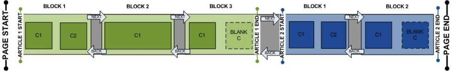
Block slider – entire page
Block slider allows for the presentation of content within a lateral scrolling layout (shown below). This layout can be used in a linear navigation model, loading Article 1, Block 1 first and then asking the learner to work through the blocks of content as if they were pages in a more traditional e-learning course. Alternatively, it’s possible to specify the load point to occur anywhere within the page, creating a more exploratory learning experience with content available both left and right of the starting point.
Continuing to put the learner first
We should continue to put the learner at the heart of what is produced, writing well-structured content which follows an appropriate learning model and adheres to best practice in instructional design. Adapt is rather a response to the changing nature of how this content is accessed and what our learners expect from their interactions with technology.